Following up the content restructuring I did last week, I began building out wireframs schematics for how the content my start to lay out on a page. Taking direction from the hypothetical RFP, I simplified the search and made the mission statement prominent. The idea is the mission statement with describe what users can expect from the site. In fact, the mission statement is where, normally, you would find the logo and acts a link to the homepage.
I also recognize the importance of good copywriting on a website. In several places, I should short samples of text where pointed copy would add to the intent of the overall design.
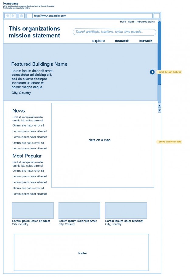
The Homepage – explore curated content
In this version, the design leads with featured, curated content. It is designed to have the use explore different parts of the site.
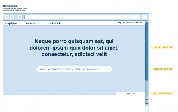
The Homepage – begin your research
In this version, the layout prompts visitors to enter search terms and begin their search. This simple prompt gives the impression that you can search for anything, not restricted by categories or type of content. It infers that there is a large amount of data behind the site.
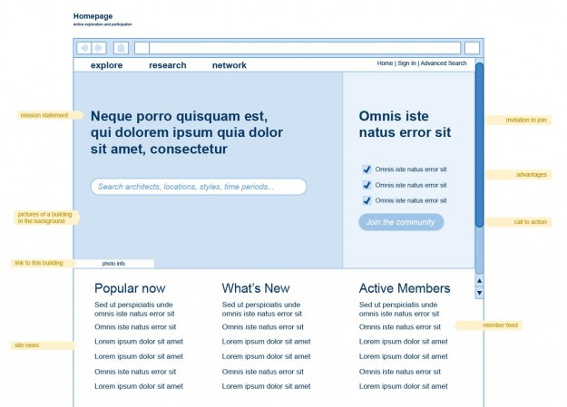
The Homepage – begin your research or join the community
The Master Interior Template
This wireframe shows what a main page for on building would look like. It features a slideshow of photography, a short header description, a longer description, data points abou the building (year, city, style, etc), a map showing its location as well as other nearby buildings or points of interest, comments from the community, a list of members who ‘like’ the content or saved it to their profiles, and finally link to other content related to this particular piece.
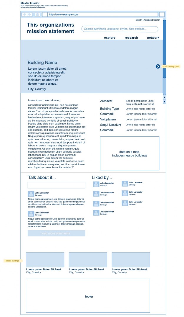
The Master Interior – alt design
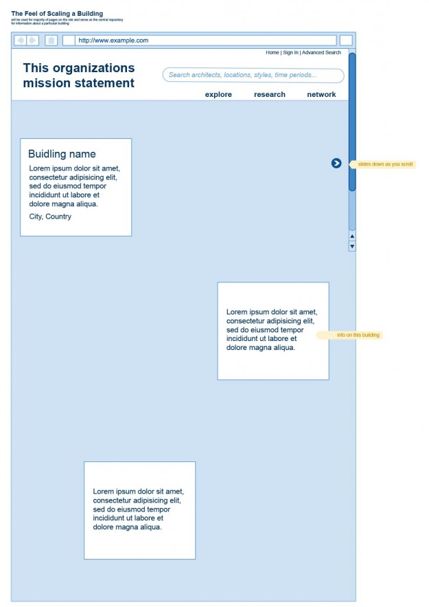
This version of the master interior page is an exploration of how I could design for the content itself. The buildings on this website are deemed great–great in size, great in historical significance, great in architecture, and more. I wanted to see if I could bring the sense of grandeur in the experience of reading more about the building. I decided to use as much vertical space as needed and spread the content out as you scroll down. I’m to give the visitor a feeling of scaling the building as they scroll. A photo would take up the all the blue shade in the image below. The arrow on the right side will move down with you as you scroll down and can be used to cycle through images of the building in question.
I am aware that this is not a perfectly functional way to get all the information that needs to display on this page. This was mostly a design exercise.
Landing Page – Explore
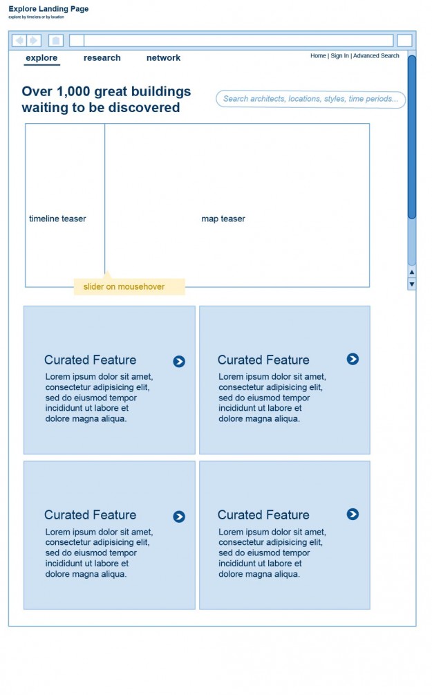
The intent of this page is to get visitors to explore the content on the site. These types of visitors presumably don’t have a particular question they need answered. Instead they want to be entertained and informed by the content. Here I used the timeline and the map as interactive content they can explore on their own. Below this is a list of curated features written by the staff of the site or bloggers from the community. Notice that the search bar from the homepage is still prominently displayed as another way a visitor can decide to explore.
Landing Page – Research
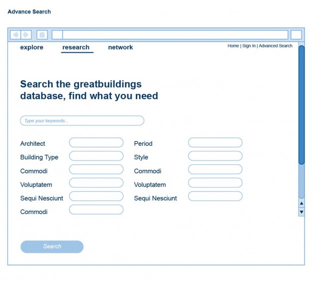
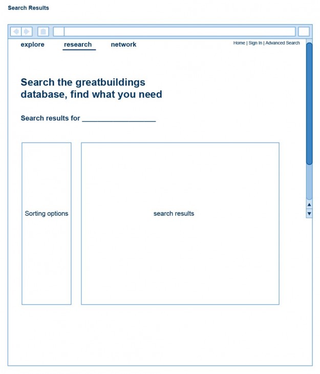
Being able to conduct research against greatbuildings.com’s database is major reason to visit the site according to our hypothetical RFP. Here I show how we might lay out the advanced search and the search results page.
