User Testing Findings

The Testers

User #1:
Age 29, Human Resources Manager, Brooklyn native
Uses the web for mostly email (personal and work emails are always on)

User #2:
Age 32, female,  Social Worker/Therapist, Brooklyn native
Uses the web for light email, most recently for vacation planning, general research

User #3:
Age 33, female, Social Sciences Researcher, PhD Candidate, Professor, new-ish to Brooklyn, by way of NJ and lots of other cities
Rarely uses the web.  Uses it primarily  for research
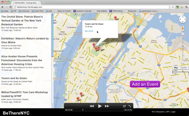
What I found Continue reading

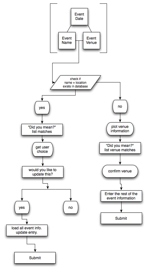
Submitting an Event – User flow

From my user testing, many people got stuck at the submission process so I built out a user flow to better understand the interaction.

I also decided to remove the login process altogether. It’ll be more like a wiki.

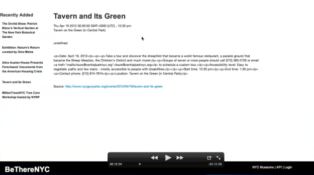
betherenyc user testing prep

In preparation for user testing next week, I came up with 5 questions/tasks what I want to get out of testers:

  1. What do you think this site is about?
  2. What is the first thing you notice about this app?
  3. Find an event that you are interested in, near here.
  4. Find an event at a different location (like closer to home or work)
  5. Add an event to this app that you’d like to share.

Simple Direction, wayfinding app

David Gibson, wayfinding expert and author of The Wayfinding Handbook: Information Design for Public Spaces, spoke to our user experience class a few weeks ago. After his presentation on how he and his team design wayfinding experiences, we had an interesting discussion around GPS navigations systems. A classmate told a story of how his friend, new to NY, a year later still didn’t know where anything in the city was. He used Google Navigation to get anywhere. His face stuck on his phone, he spent all his journeys, long or short, watching his blue location arrow advance and made sure it followed the glowing digital path laid out for him.

The awesome thing about GPS navigation systems is that you’ll never get lost. There are even algorithms for travelling the shortest route, the cheapest route, or the route with less traffic. But the thing that sucks about GPS Navigation is also that you’ll never get lost. Following bullet pointed, step-by-step directions takes away from the opportunity to discover things on your own. Continue reading

IRC Mobile App Proposal

The Brief

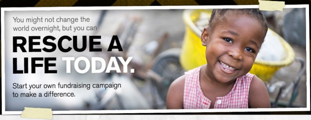
Based on a creative brief, Carlin and I have been thinking about how a the International Rescue Committee could use mobile-based technologies as a way to ultimately garner donations and raise awareness about the organization.

Looking at some of their competitors, we didn’t find much on mobile. My research on uses of mobile tech in non-profit organizations didn’t garner much beyond stressing the importance of creating a mobile-friendly version of their website. I think that that is a given.

For this exercise, we wanted to see if we could do more. Continue reading

Wireframes for greatbuildings.com

Following up the content restructuring I did last week, I began building out wireframs schematics for how the content my start to lay out on a page. Taking direction from the hypothetical RFP, I simplified the search and made the mission statement prominent. The idea is the mission statement with describe what users can expect from the site. In fact, the mission statement is where, normally, you would find the logo and acts a link to the homepage.

I also recognize the importance of good copywriting on a website. In several places, I should short samples of text where pointed copy would add to the intent of the overall design. Continue reading

GreatBuildings.com content restructuring

For this week’s assignment, we received a hypothetical RFP for resigning the greatbuildings.com website. The current site is confusing, brings you though loops, and leads you outside of the site without you expecting to. It suffers from many things, but it mainly seems like they didn’t think about how the site would be experienced as a whole from the user’s perspective. The lack of visual hierarchy and  the confusing information architecture makes the site difficult to navigate.

Our sample RFP defines the project’s objectives as:

  • Make it easy for students and people passionate about buildings and architecture to find what they are looking for and learn more about what they find
  • Encourage discovery and exploration of new buildings
  • Be a resource for information about buildings
  • Encourage a community of interest around architecture and buildings
  • Allow the community to enhance the catalog of buildings and related information

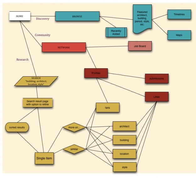
I broke this down into 3 objectives for the user:

  1. Be able to conduct research
  2. Browse and discover interesting content
  3. Identify themselves within the community

From there, I fleshed out the revised architecture for the site at the top of this post.

Barbara’s Way – user experience as a business

The Problem

Historically, women lack the confidence or opportunities to tackle home improvement, automotive, and electronic projects themselves. Times are changing. And we are beginning to be more open about gender roles as being fluid, rather than binary. However, the tools themselves and how they are marketed haven’t changed. Continue reading

Core Idea and Wireframes

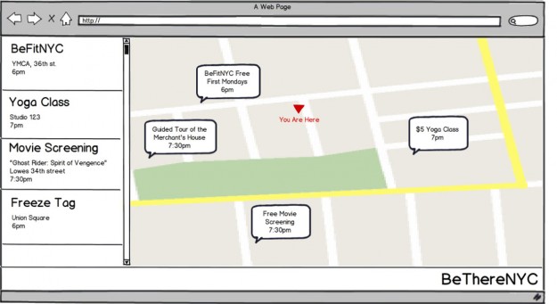
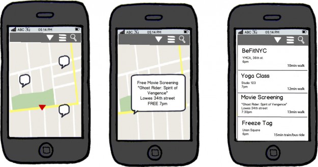
This week’s assignment is about focusing on the Core Experience. We were to develop a simple, single concept idea such as thistothat.com or cuteroulette.com. Develop a web homepage schematic or key screen of an app for our idea. The key is to state a clear value proposition and then represent it schematically using the tools in Balsamiq.

For my project betherenyc the core idea is:
to find events that are happening around you and now.

Here are some wireframes I came up with on the desktop and mobile versions.

NYC Go vs TimeOut NY: a Comparison in User Experience

I’m a cheap Nuyokah. My Goal: to find free and cheap events in NYC happening now, today, and soon!

View Slides.

Proudly powered by WordPress
Theme: Esquire by Matthew Buchanan.