Wireframes for greatbuildings.com

Following up the content restructuring I did last week, I began building out wireframs schematics for how the content my start to lay out on a page. Taking direction from the hypothetical RFP, I simplified the search and made the mission statement prominent. The idea is the mission statement with describe what users can expect from the site. In fact, the mission statement is where, normally, you would find the logo and acts a link to the homepage.

I also recognize the importance of good copywriting on a website. In several places, I should short samples of text where pointed copy would add to the intent of the overall design. Continue reading
GreatBuildings.com content restructuring

For this week’s assignment, we received a hypothetical RFP for resigning the greatbuildings.com website. The current site is confusing, brings you though loops, and leads you outside of the site without you expecting to. It suffers from many things, but it mainly seems like they didn’t think about how the site would be experienced as a whole from the user’s perspective. The lack of visual hierarchy and  the confusing information architecture makes the site difficult to navigate.

Our sample RFP defines the project’s objectives as:

  • Make it easy for students and people passionate about buildings and architecture to find what they are looking for and learn more about what they find
  • Encourage discovery and exploration of new buildings
  • Be a resource for information about buildings
  • Encourage a community of interest around architecture and buildings
  • Allow the community to enhance the catalog of buildings and related information

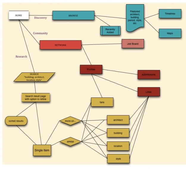
I broke this down into 3 objectives for the user:

  1. Be able to conduct research
  2. Browse and discover interesting content
  3. Identify themselves within the community

From there, I fleshed out the revised architecture for the site at the top of this post.

Proudly powered by WordPress
Theme: Esquire by Matthew Buchanan.