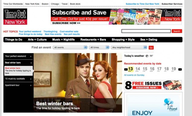
For my first assignment in 2D Design, I decided to review the TimeOut New York website based on the principles of visual communication we went over in class. For this review, I am only focusing on the homepage.
The Grid
TimeOut is using a 5-column grid to organize content, with the 5th column being the width of 2 of the other columns. They play within the the grid at various point on the page and some content will take up multiple column widths.
Excluding the 5th column sidebar, the column numbers progress as follows:
- 1 column for the masthead which include the logo, “hot topics,” and the navigation
- 1 column for the main feature area
- 4 columns for the subfeatures
Once past the subfeatures, there’s an additional left rail that takes up a column, with:
- 1 column for the “Top Stories”
- 3 column scrolling section for “What’s on at…”
- and 2 column for an ad and “More New York”
Typeface

TimeOut uses Arial and their main typeface with variation in weight and size.
The colors for the TimeOut website are the black, white and red of the TimeOut logo. All the text is black, except the subtitles are in red and the navigation in white with a black background. There’s a secondary color, light blue, that is used for links. Certain action items are also red, like the search button and the Go button.
In the subfeature section of the homepage, the subtitles of the eight different sections are all in different colors. I think this is to match the print edition of the magazine. Those title colors carry over to the category’s landing page.
The site is very image heavy. All the images are contained in neat the rectangles accompanying text. They are all really specific to the content that they are illustrating. The images are quite literal.
Hierarchy
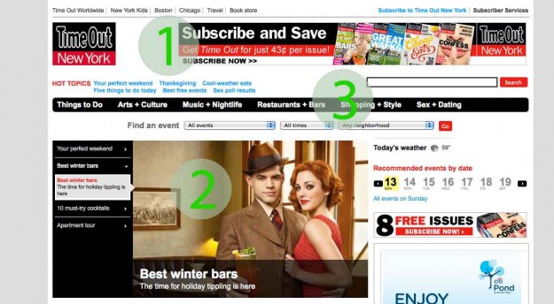
The first thing to catch my eye on this homepage is the “Subscribe and Save” banner at the top. I’m sure this was done on purpose. The main purpose of the site is to sell more magazines.
The second item in the heirarchy is the main image rotator with the accompanying titles. In fact, the titles seem to be the same size as the “Subscribe and Save” text in the ad.
From there, my eyes gravitate towards the main navigation. It stands out with its black background and white text, the inverse of the rest of the page.
Alignment
All content is neatly aligned to the left of the browser window. However there are a few elements that don’t follow this rule.
The sorting fields for “Find an event” are aligned to the center, but I think this is an advantage. This section sits in between the main navigation and the main features, but it is noticeable because of its alignment and it’s white background.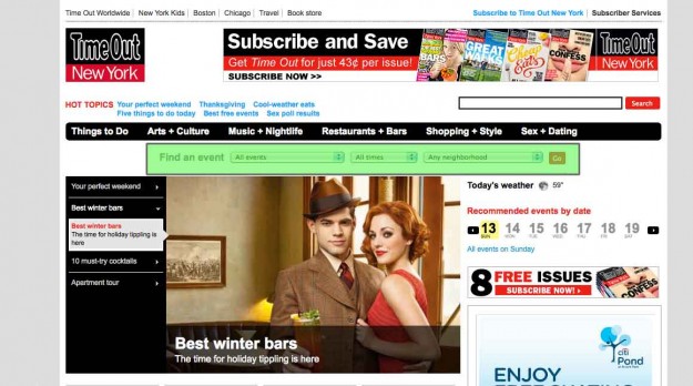
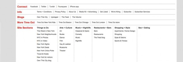
In the footer, the first item is “Connect,” and the links that follow do not align with the other links below it. This was very noticeable to me, and actually bothered me a lot.
White Space and Negative Space
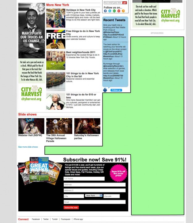
There isn’t much white and negative space on the TimeOut website. It is a content heavy site, and they make that evident with the lack of white space. The most white space on this page occurs when there wasn’t any more content to go in a column and the column next to it was still going. As you scroll down, there is white space that is growing on right side, beginning underneath the last two ads in the last column. The white space spreads into the before-last column, and so on, until the footer. Because the rest of the page is so dense, as soon as the white space starts to creep in, I also begin to lose interest in the page’s content. These feel like afterthoughts.
