Analyzing Twitter Data and Timeseries
This week we are analyzing more twitter data and looking at timeseries!
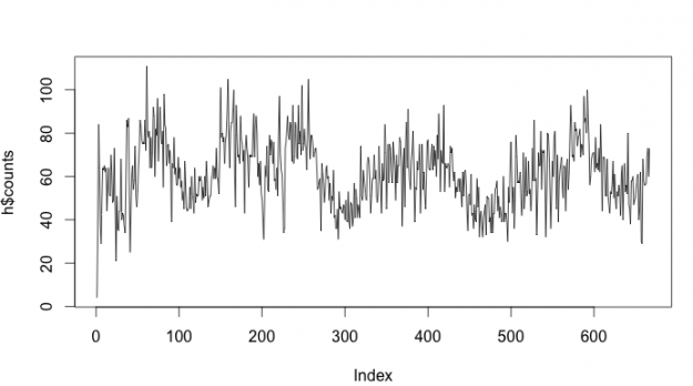
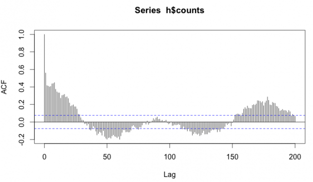
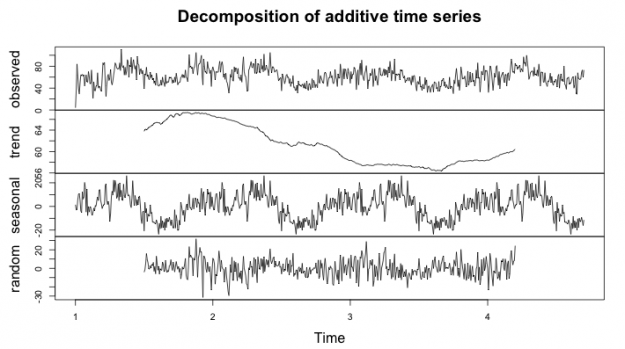
Rhythms of Twitter
Let’s Get Political
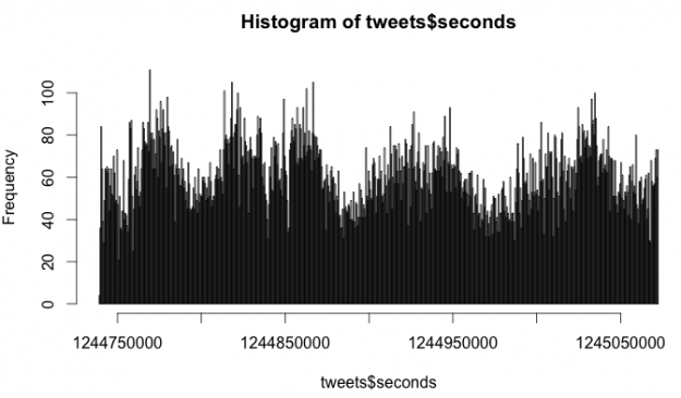
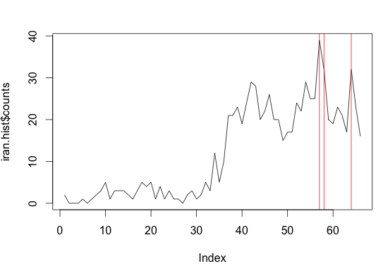
Iran Tweets Over Time Histogram
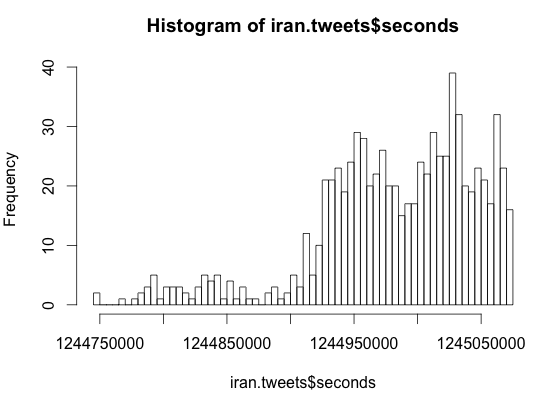
Iran Tweets Over Time, with Top 3 times highlighted
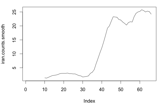
Iran Tweets Over Time, Smoothed
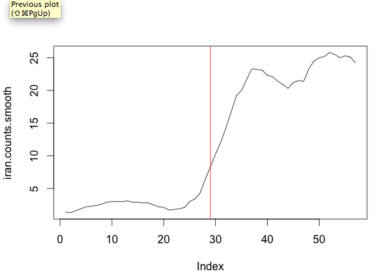
Iran Tweets where the Biggest Change happened
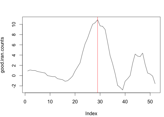
Biggest Change Correlated on the actual tweets over time (these are the tweets we want to read
Twitter Data Analysis with R
Part 1
Part 2
Part 3
My family is from Haiti and I want to see what people are saying. I took streaming data about “haiti” for 1 hour and 15mins around 4pm on Thursday, Sept 27.
my questions:
where are they tweeting from?
how many tweets did i collect in over an hour?
what are these tweets about?
is there a difference about what people are tweeting based on location? What are people in Haiti saying?
Stop and Frisk Data, Part 2
HOMEWORK PART I
Question #1
Write code to return the percentage of people who were frisked for each race. In other words, count up the number of people who were frisked for a given race divided by the number of people of that race stopped. Which race leads to the highest percentage of frisks? Which one the lowest?
The race leading to the highest percentage of frisks is Black Hispanic at 59.7%
The race leading to the lowest percentage of frisks is White at 41.9%.
Question #2
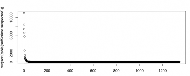
Plot the number of times each crime occurs in descending order (we’ve learned a couple of ways to do this, though using sort(), table() and that new type= parameter to plot() is your best bet). What does this distribution of crimes look like? In other words, are there an equal number of every kind of crime or are there a few that dominate?
No, they are not equally distributed. There are a few that make up most of the crimes suspected.
Question #3
Well I’m kind of answering that question for you here – let’s take the top 30 suspected crimes and look at those. If we were to just look at stops where the crime.suspected was one of the top 30 crimes, what percentage of the stops would that cover? Do you think that’s enough?
The top 30 crimes suspected cover 91.3% of all crimes suspected. I think that that would be enough.
Question #4
Write code to create a variable called “crime.abbv” that consists of just the first three letters of crime.suspected and show the code to add it to our main data frame. Now what percentage of the stops do the top 30 crime.abbvs account for?
Now, using the abbreviated names for the crimes suspected, the top 30 make up 98.4% of all crimes.
HOMEWORK PART II
Stop and Frisk Data
Last week, in Data without Borders, we started by taking a look at the Stop and Frisk data from November 2011 and getting comfortable with the R programming language.
Here’s the code I used to answer the questions from the homework.
