Michelle Boisson

interaction design and creative strategy

Lumiere Video Editing App

Local Projects was commissioned to design and build an iPad app for the Jacob Burns Film Center. Working directly with their lead interaction designer, I built web-based prototypes to help bring the concepts and interactions to life.

>> Play with the prototype here << Lumiere teaches the fundamentals of visual storytelling through “viewing and doing” challenges in which students combine the basic media building blocks of text, image, video, and sound. Students drag and drop video clips onto an infinite canvas, make cropping edits, connect the clips visually, and have the sequence play back in a preview mode. Using HTML5 and JavaScript, I built the first prototype under a tight deadline of one week for presenting to the client. The following weeks I continued to refine the interactions and build in new features. It allowed the team to get a better feel of application and make tweaks accordingly. The client also appreciated the constant updates. This workflow was so successful that a year later local projects began hiring more designers with technical skills to build functional prototypes. >> Play with the prototype here <<
Github code here.

* drop videos in the placeholders from your desktop
* move the videos around by grabbing them and dropping them
* click individual video thumbnails to play/pause the video
* double-click a video to open the editor: move the sliders to set in and out points for the clip, click delete button to remove from canvas
* attach the right dot of a video to the left dot of another video to have them play sequentially
* click “play sequence” button to play the thumbs in sequence
* click “play sequence fullscreen” to open up a bigger player where the videos will play in the same holder in sequence
* click on this to enter true fullscreen mode
* “play sequence fullscreen” button turns into “close fullscreen” button ~~ for now, the user must start the first video by clicking on it, so the player knows where to where to start

Humboldt Forum Microsite

In the soon-to-be reconstructed Berlin Palace, museum, library, university, and event venue will merge to create a thriving meeting point for people from all over the world – irrespective of their origin, age, educational background, interests, experience, and personal tastes. This meeting-point and melting-pot will be the Humboldt-Forum. While reconstruction for the new venue was under way, I was commissioned by Ralph Applebaums Associates’ Media team to develop the Humboldt Forum microsite, describing the future of the museum.

The website feature a fluid layout, dual-language, Angular.js, Vimeo API with dynamic subtitles, custom CMS-less content integration solution, and scroll-based interactives.

Simple Direction, wayfinding app

David Gibson, wayfinding expert and author of The Wayfinding Handbook: Information Design for Public Spaces, spoke to our user experience class a few weeks ago. After his presentation on how he and his team design wayfinding experiences, we had an interesting discussion around GPS navigations systems. A classmate told a story of how his friend, new to NY, a year later still didn’t know where anything in the city was. He used Google Navigation to get anywhere. His face stuck on his phone, he spent all his journeys, long or short, watching his blue location arrow advance and made sure it followed the glowing digital path laid out for him.

The awesome thing about GPS navigation systems is that you’ll never get lost. There are even algorithms for travelling the shortest route, the cheapest route, or the route with less traffic. But the thing that sucks about GPS Navigation is also that you’ll never get lost. Following bullet pointed, step-by-step directions takes away from the opportunity to discover things on your own.

Learning Through Mistakes

As humans, we learn from making mistakes and from making the wrong turn, literally and metaphorically. If instructions for solving a problem are just laid for us in bullet points, we won’t remember as much than when we  have to build logical and emotional connections ourselves.

…and Having Fun While Doing It

There’s a theory of fun in game design that I’m finding to be supported more and more in my own observations. Raph Koster, in his book “A Theory of Fun” concludes that fun equals opportunities to learn.  An activity is deemed fun when it’s not too easy that you get bored, it’s not too hard that you get frustrated, and that the opportunities to learn are well paced.

In my experience, sometimes getting lost is much more fun, then getting to my destination.

The Simple Direction Mobile App

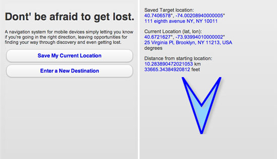
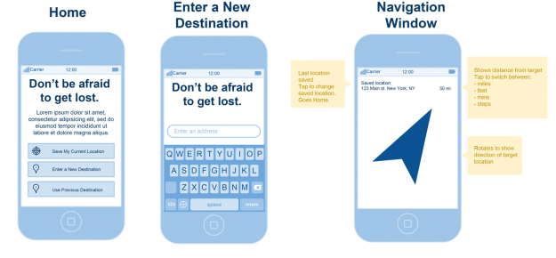
The app I’m building is a navigation system for mobile devices simply letting you know if you’re going in the right direction, leaving opportunities for finding your own way through discovery and even getting lost. It’s the only wayfinding app that finally values the journey over the destination.

I wanted to strip down a navigation system to a core idea: to let the user know what direction they should going to get to their target destination. It’s a sort of customized compass that points in the direction you need.

The idea is that you could be walking, biking, discovering the space around you. And when your ready, you can check the app and make sure you’re on course. The app doesn’t care whether you follow the arrow or not. It’s just a reference and it’s there whenever you choose to look at it.

How it works

The HTML5 app prompts you to either enter a new destination or save your current location as place you’d like to return to. As you move about, you current location and bearing (heading) is calculated in relation to the destination. The latitude and longitude coordinates of your target destination are saved in local storage of the browser, so you can close the app and come back it whenever, even days later, and it will give you a reference to that location. You can change the destination at any time.

I’m using Google’s geocoder for translating the latitude and longitude coordinates to an address and vice versa.

How it doesn’t work (yet)

I’ve been able to get current location, save a destination location, and calculate the distance between the two in kilometers and in feet, get the direction you are heading in relation to North. However, the main part of the app is still  in progress: pointing the arrow to the destination location. I also want to calculate the distance in terms of a time estimate based on how fast you are currently moving.

More on this come. You can follow the code on github.

BeThereNYC

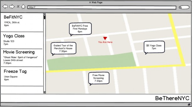
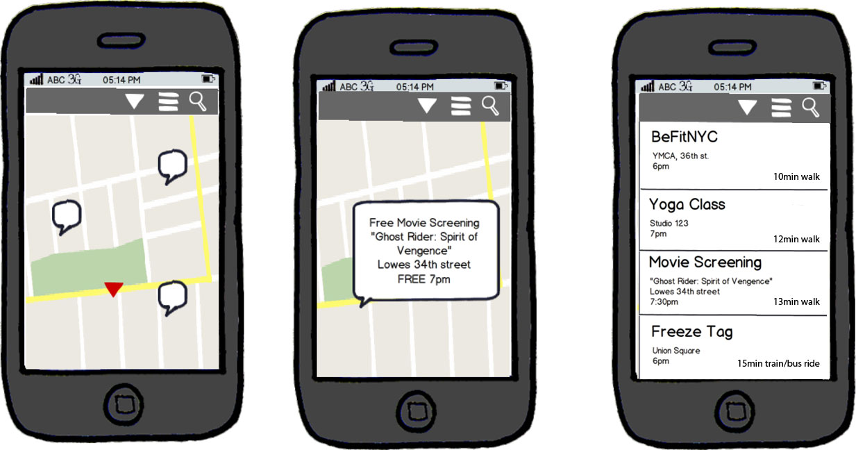
BeThereNYC is about free, cheap, fun, here and now. It is a personal project I started tinkering with in Spring 2010. I wanted to create a site that listed all the free and cheap events around the city.

Every summer I’d aggregate the calendars from organizations like SummerStage and River to River into one shared Google calendar. I’d share it with friends who in turn would share it with their friends, and they found it so useful that I started to become known for it over the years. I made it a personal project to see if I can make a usable website with the same concept. I would fill in all the summer calendar and visitors will have the opportunity to post their own events or events they’ve heard of.

I refined this project while at ITP and focused the core idea: events that one could go to now or in the very near future. BeThereNYC focuses on whats happening around you, now and and with in the next 36hrs. Read about my progress on my school blog.

I built a JSON API for the data so anyone can use the events in their own project and the entire project is open source. It built with Node.js. You can view all the code or fork it on GitHub.

Usability Testing

I used a technique outlined in this video, and sat down with three people to do user testing.

  1. I defined 5 most important things people should be able to do or know.
  2. I wrote a script for myself
  3. I started by asking about who they are, they’re level of comfortability with tech, and chatted a bit so that they are comfortable talking. 
  4. I asked about their first general impressions of the site.
  5. Then I asked them to perform a task that I’ve outlined while talking out loud as much as possible, so I can hear their thought process. The tasks I outlined were:
    • find an event happening near you now and share it with a friend
    • find an event happening in another specified area later today
    • add an event to the site
  6. At the end I allowed them to ask questions and would fully describe my project.

You can find a detailed script and the feedback on my student blog here.

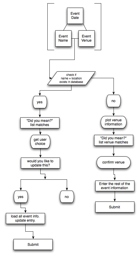
People had the most trouble in adding an event and in finding the home button (or logo). So I moved the logo to the top, a more traditional place. I spent some time really crafting the event submission process which was something I had taken for granted the first round, and created the tree below to fully understand the steps need to adding an event to the site. I was also careful to use friendlier language in the form itself so it wasn’t so bland. Check out the final results: betherenyc.com

Emo Ant HTML5 Comic

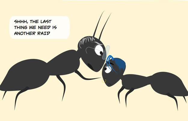
This comic is an experiment using new front-end tools available with webkit browsers. with an interactive interface online. As the user scrolls down, the story advances with animated transitions giving the user full control of the flow and speed. I’ll be using parallax effects, css3 transformations, and javascript queueing for the speech bubbles.

See the comic here: emoant.com

In this story, Cameron is a rebellious teenage ant. We meet him at the breakfast table with his family while his hundreds of siblings are diligently doing there part. Cameron, on the other hand, flies into the scene on a makeshift parachute he built himself, and scoffs at the processed foods and artificial ingredients. His emo hairstyle and dress makes him stand out even more and are the topic of conversation between Cameron and his parents.

Interbrand’s Best Global Brands 2010

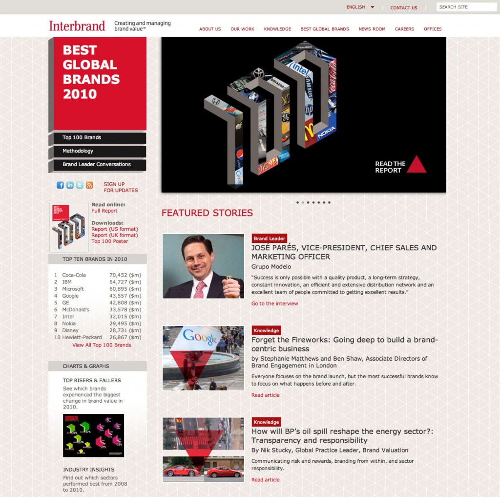
Building on the success of the Best Global Brands 2009, we looked to push the design and architecture a bit further. As a result, the website earned an Official Webby Honoree nomination and a Silver Award at the 2011 W3 Awards.

I translated the designs into code and hand-coded the framework.