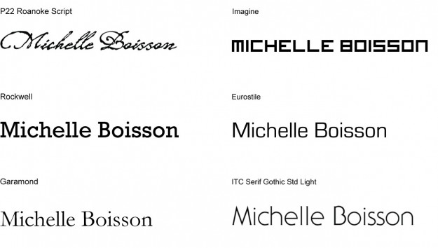
This week we had to set our names in 6 different typefaces that we feel say something about us or the character of our name.
Michelle Boisson
Things to consider about my name:
- no descenders, everything stays at the baseline
- my first name has 3 ascenders, none in my last name
- many “round” letters – c, h, e, l, b, o, s, n
- two double letters – double l and double s
- name starts with a capital M, one of the few non-rounded letters.
- my last name means “drink,” as in the noun “drink,” in French
Here are my font choices:
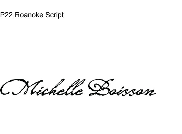
This choice has a little story: Over Thanksgiving, my partner and I spent time at my parents’ place in Queens. Somewhere between the stories of early family vacations and distant relatives in Haiti, my mom brought out old report cards from my elementary and high school. I went to a fancy French school in Manhattan. It was a great school, but I always felt awkward. There was a huge social class difference and language barriers between me and the other students. I was there thanks scholarships and working-class parents determined to give me the best opportunities. Though they emigrated from Haiti and spoke Creole themselves, we never spoke French or Creole at home.
This typeface choice is a nod to that part of my history. The script looks like it was done with a fountain pen, something we practiced in elementary school. The type is personal, because it looks handwritten. But there’s also something uneven and shaky about it, almost as if if was written while riding the train.
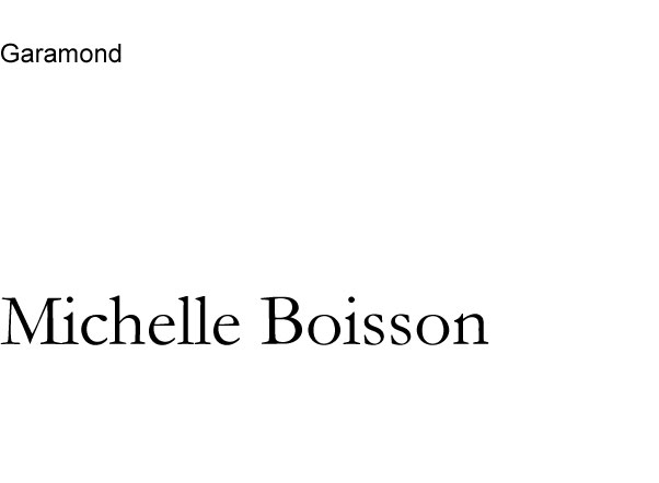
I chose Garamond for aesthetic reasons. It is one of favorite typefaces. It’s clear. It’s balanced. The letterforms are open and round, so curves look great around all the curved letters in my name (c, h, e, l, b, o, s, s, o, n).
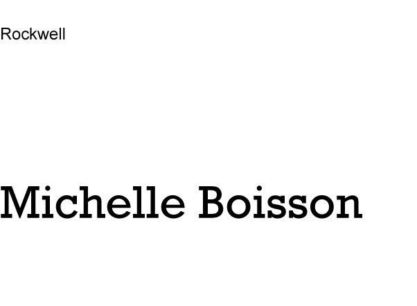
Rockwell is another classic typeface we went over in class. But I love it because there is little difference in the thicks and thins. it’s no frills and straightforward. The thick serifs grounds the letters.
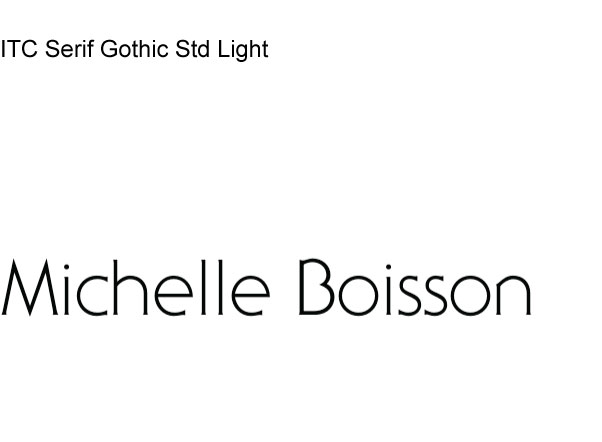
Again, I have many rounded letters in my name so I thought this openness of this type would work well. One of the few unrounded letters in my name is the very first letter, capital “M.” It’s distinct by its sharp edges.
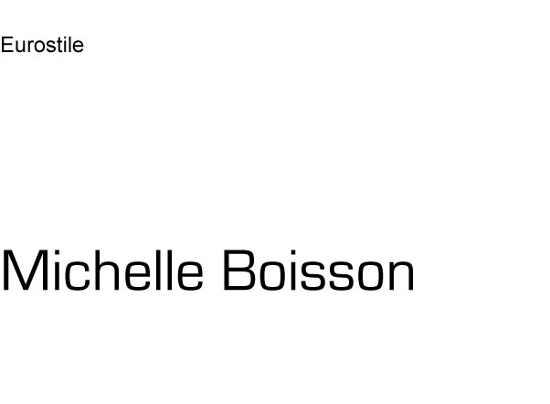
Eurostile adds a bit of stiffness to the round letters, but keeps them soft.
I have terrible eyesight and this reminded me of the “E” charts from the optometrist office.
Expressive Words
Uses Atomic Clock Radio
Uses Mister Loops
