Michelle Boisson

interaction design and creative strategy

Expanding the Used Cars Research Experience

Role
Product definition, information architecture, user research and synthesis in collaboration with a UX researcher, collaborating with a data scientist to produce data-driven prototypes, workshop facilitation with stakeholders, requirements documentation and prototyping.

Observations
Through interviews and surveys, we also learned that used car shoppers are not interested in learning how a car performed when when it was new, which is what CR’s main reporting is about. They were much more interested in learning how other owners felt about the car. The closer they could get to speaking to the previous owner of a car, the better. In speaking with our car testing experts, we learned that, while we don’t test the same model every year, we do test them when their are major changes or redesign to the model.

Issues
The experience on Consumer Reports used cars information was pretty dire considering the rich information they’ve been collecting over the last 15 years. A used car model page was in fact a general description of the model and it’s performance over the last 10 years. This is not in line with how used car researchers look for information.

Solutions
I came up with an information architecture that would support our user’s research behavior in providing details about individual model years and leaning on smart use of user-generated reporting via our surveys.

While CR does not test used cars–they only test new cars, their annual survey of about 1 million vehicles tells the story of how used cars are performing today. This data was traditionally used to exact a reliability score for every model year. I proposed new ways of using that data so that we could report on used cars. It was a major shift in design, product, and analytics

Results

  • Consumers are able to read and compare 10 years of CR data on car models, year by year
  • Tighter integration of user-generated reporting and CR’s test data
  • Alignment of consumer’s research behavior with the architecture of the interface and data that they find more appealing
  • This architecture stemmed from my work with the mobile apps team, but is now being adopted by the website team


Prototypes

Initial Prototype http://4lwazs.axshare.com/view.html

Car Ownership App Interaction Exploration (concept: scroll through past and potential future issues)
http://michelleboisson.github.io/cr-mobile-mycarfuture/

Car Ownership Click Through (concept: predict my car’s future)
https://invis.io/DU9B24R6W#/56347919_Homepage_Android


img_20150619_154329534 img_20150619_154403182 Screen Shot 2016-10-31 at 5.05.18 PM Screen Shot 2016-10-31 at 5.05.25 PM

Cell Phone Service Plan Helper

Role
Lead strategist, facilitator, prototype maker. I documented our process on a tumblr blog.

Observations
Choosing an optimal cell phone plan and switching carriers is a painful process for most. In interviews with consumers, we heard a lot about a fear of switching. Many people had a sense that they were not getting the best deal but also resisted switching because of fear that another carrier might be worse. While some have brand loyalty to the company they are with, most are frequently looking for the best deal. Trends with carriers include plans with no contracts and unlimited talk and text, which boils down the decision for most consumers to price and coverage.

Screen Shot 2016-10-31 at 11.57.09 PM

Issues
Carriers are constantly changing their plans, making it difficult for consumers to make an apples-to-apples comparison. Newer, smaller carriers sometimes have good prices but it is not always clear what networks they run on and, ultimately, what kind of coverage one can expect.

Consumer Reports’ data on cell phone carriers was collected through their survey research center.  Over 106,000 consumers reported on their experience with 21 carriers. The output of the annual survey was a set of scores for each carrier based on the consumer responses. We were seeing an opportunity to extract more insight based on the questions our target audience was asking themselves.

Our problem statements
A diligent researcher trying to sift through the details needs to clearly understand all of the options in optimizing the value of a cell phone plan because carrier pricing is not straightforward and they are unhappy with how much they are paying.

A value optimizer, weighing their options in switching cell phone carriers, needs to understand the experience of consumers at smaller carriers because trusted reviews on these carriers from consumers in their neighborhood are hard to find.

Solutions
We brainstormed and iterated on solutions, checking with consumers via surveys and interviews. View our full process documented here. We narrowed down our solutions to 3 prototyped concepts:

The Ultimate Cell Phone Plan Finder:
An attempt to make all plans across the Big 4 comparable 1:1
Emphasis on a DIY-approach to exploring and ‘playing with’ the data

Cell Plan Genie:
Emphasis on education and giving a strong recommendation

Real Talk:
User-Generated Carrier Profiles
“What carriers don’t want you to know”

I documented our process on a tumblr blog.

Car Buying Guide for iOS and Android

My Role:
Product definition, information architecture, user research and synthesis in collaboration with a UX researcher, workshop facilitation with stakeholders, requirements documentation and prototyping.

Observations:
Most people looking into purchasing a new car tend to focus on which model is right for them, narrowing their choices to a few models, ignoring trim in the beginning. Once they’ve settled on a model, their focus will shift to selecting trims and options. Another observation revealed that car researchers are in a mode of constant compare, hoping to validate that the choice they’ve made is the right one.

Issues:
Consumer Reports car testing and reporting is second to none and a major driver for new signups. Despite it being one of the biggest franchise areas for the non-profit, there were many holes in the user experience that didn’t match how the target audience does car research. We were forcing them to decide on a trim or to draw their own conclusions when comparing models by jumping between tested trim pages in the interface.

Solutions:
In comparing the user’s research journey with the strengths in CR’s car testing , we came up with this statement: “We test cars to report on models.” This means, we can’t test every trim in a model, but we can use the data we have in the trims we do test to inform our reporting on a model. In aligning our focus with the major pain point of comparing and deciding on a model, we can be a better serve our members during the car research process.

Screen Shot 2016-10-31 at 4.09.21 PM

To support the mental mode of constant compare, we represented every model with 3 data points: overall score, MPG and price, making it easier to compare models at every step of the journey. These were the three most important factors in beginning to compare models.

Screenshot_20161031-162721 Screenshot_20161031-162745

Results:

  • streamlined user experience that aligns with how members do research
  • turned a hole in the experience (the fact that we can’t test every trim) into an opportunity
  • removed a lot of redundancies
  • this architecture stemmed from my work with the mobile apps team, but soon after was adopted by the website team


img_20150120_153703031 img_20150206_144127012 img_20150413_125548763 img_20150413_125513199 img_20150413_125413448 img_20140528_120632883 img_20140206_150736174 img_20140722_150255063buildnbuy-cr-only-flow

Lumiere Video Editing App

Local Projects was commissioned to design and build an iPad app for the Jacob Burns Film Center. Working directly with their lead interaction designer, I built web-based prototypes to help bring the concepts and interactions to life.

>> Play with the prototype here << Lumiere teaches the fundamentals of visual storytelling through “viewing and doing” challenges in which students combine the basic media building blocks of text, image, video, and sound. Students drag and drop video clips onto an infinite canvas, make cropping edits, connect the clips visually, and have the sequence play back in a preview mode. Using HTML5 and JavaScript, I built the first prototype under a tight deadline of one week for presenting to the client. The following weeks I continued to refine the interactions and build in new features. It allowed the team to get a better feel of application and make tweaks accordingly. The client also appreciated the constant updates. This workflow was so successful that a year later local projects began hiring more designers with technical skills to build functional prototypes. >> Play with the prototype here <<
Github code here.

* drop videos in the placeholders from your desktop
* move the videos around by grabbing them and dropping them
* click individual video thumbnails to play/pause the video
* double-click a video to open the editor: move the sliders to set in and out points for the clip, click delete button to remove from canvas
* attach the right dot of a video to the left dot of another video to have them play sequentially
* click “play sequence” button to play the thumbs in sequence
* click “play sequence fullscreen” to open up a bigger player where the videos will play in the same holder in sequence
* click on this to enter true fullscreen mode
* “play sequence fullscreen” button turns into “close fullscreen” button ~~ for now, the user must start the first video by clicking on it, so the player knows where to where to start

WorkJam

WorkJam is a hypothetical system that helps regulate your mental energy with music while you’re working. It listens to your brain activity and responds with smart song selections to keep you in the creative flow.

The Problem

I’m not good at taking breaks when I’m working. Once I get started, I tend keep going and going until I’m totally spent, feeling a little crazed by the work, and in dire need of a mental break, some fresh air, some food, or any combination of them.

I wanted to design a system that would help me regulate my energy and eventually take breaks.

The Process


Using Paul Pangaro’s model for first-order feedback loops, I started diagramming possible intervention systems.

The Goal defines the relationship that the systems wants to have on the environment:
maintain high to medium energy levels while doing work, and take a breaks when regulating becomes more difficult.

Environment:
My mental energy levels

Disturbances to the Environment:
How much sleep I had the night before, what I ate or drank earlier, how active I was that day, my mood, or even the energy in the room, are things that can affect my energy levels, and that live outside the system.

Sensors:
Some things that give away my energy levels are: yawning, posture, lazy typing, rubbing my eyes, eyes feeling heavy, frequent blinking; or on the other end I’m having fun, I have lots of ideas, thoughts, and questions, and I’m engaged in the work I’m doing. I could also try to deduce my energy levels based on the passage of time. The Ultradian Cycles tell us that our brains naturally go through peaks and valleys of energy multiple times a day, usually every 90 to 120 minutes.

But when we talk about sensors and actuators, we talk about them in relation to their resolution or sensitivity (how accurate is your sensor or actuator?); their frequency (how often does the sensing or action take place?); and their range (what’s the capacity, or minimums and maximums of your sensor or actuator). None of the sensors above hit the sweet spot in terms of resolution, frequency, and range. For this project, I settled on measuring brain activity via an EEG sensor.

Actuators:
Things that can have an effect on my energy levels are things like:

  • consuming energy foods or drinks
  • taking a break (like: breathing or stretching exercises, going for a walk, music and smells, washing my face, a good laugh)
  • playing high-energy music

There is strong evidence showing how music has the power to affect our emotional and energetic states. And since I tend to listen to music while I’m getting work done, I chose music as my actuator in this project.

The Results

workjam-system-web

I created a few videos and audio recordings to help describe WorkJam.


Next Steps

Going through this exersice of designing a system was really fun and challenging. I would love to build a prototype for the system itself using an EEG sensor and a music player. I’m hoping to have some time after thesis to do this.

IRC Mobile App Proposal

The Brief

Based on a creative brief, my classmate Carlin and I have been thinking about how a the International Rescue Committee could use mobile-based technologies as a way to ultimately garner donations and raise awareness about the organization.

Looking at some of their competitors, we didn’t find much on mobile. My research on uses of mobile tech in non-profit organizations didn’t garner much beyond stressing the importance of creating a mobile-friendly version of their website. I think that that is a given.

For this exercise, we wanted to see if we could do more.

iRescue Campaign

We decided to focus on the existing IRC campaign called iRescue, a DIY fundraising campaign.  You sign up, choose a cause, customize a webpage, send the links to friends, and try to get them to help you reach your goal and donate money to the IRC on your behalf. Some popular iRescue campaigns right now are Tattooers for JapanMary & Tom’s Wedding, and The National Social Work Campaign.

Working with this group of users there are a few advantages:

  • they are already supporters of IRC and understand the need for funds
  • they are planning to engage their network of friends to be supporters themselves
  • Research suggests that 70% of fundraising is done through family and friends

If we can help iRescue group with their own goals, in the end it’s benefitting both the participants and the organization, while engaging a network of people who otherwise wouldn’t be a part of the IRC family. This how we decided to construct our app.

Our Goals

We already have IRC supporters who are engaging their friends in their cause by raising awareness and collecting donations. How can we propagate this action to the second tier of engaged givers so that they too would want to avocate for the cause and engage their own network to then then donate? How can we create a ripple, effectively engaging subsequent layers of networks, collecting donations, raising awareness, and spreading the cause?

We also wanted to take advantage of the fact that this app will be used from a mobile phone. Carlin and I talked about the fact that we carry our cells with us everywhere. And I am particularly interested in how we can use this ubiquitous tool to connect with one another in person.

The Idea

sharing-web

The iRescue app is a way to help grow a network of donors for your campaign. It enables you to take in donations in person as you talk to your friends about the issues you are supporting and why you want to help the IRC. In exchange for the donation, your friend gets a copy of the app from you and is then encouraged to get other donors on your behalf. The network grows are more people are engaged.

Everyone with the app gets updates about the campaigns and can watch how it grow closer and closer to its goal through the efforts of individuals. Individual donors are linked to their parent donors (their recruiter) and to the people who they spread the app to in turn.

Using Game Mechanics

For this app to be successful, for the network of givers to really grow, we need to make sure that there is an incentive for users to share the app and the story with others. The Campaign Initiator is the main source of inspiration. He or she has started the campaign because they believe in what the IRC does or they wish to support a cause that the IRC is backing. This has motivated them enough to recruit friends to try to do the same.

As we move further away from the Campaign Initiator in Giving Graph (above) those givers are further away from the original source of motivation. To boost motivation at these tiers of engagement, we look to game mechanics.

Titles and Badges
Carlin and I discussed how we might assign badges or some sort of social status to givers depending on how their network is growing, in a similar manner to foursquare, in gaming chat forums, and even Kickstarter campaigns. In some gaming chat forums, you would earn a title rank based on how much you participate in the chatroom or in the game itself. Givers in the campaign would earn titles base on how many people they’ve recruited and how those people recruited others. There can also be titles for being active on social networks (online promotions) or how fast or how slow they recruit people.

The idea is to recognize those that are pushing mission, growing the graph, and ultimately helping the campaign reach it’s goal.

The “Game” Board – Visual Graphs
The visuals of the Giving Graph will also show the progression of network and identify active and inactive participants. Our hope is that people will either be motivated to see their section grow and their titles change or be motivated by seeing how other people are pushing the mission.

Alerts
The app will also alert players of the status of the campaign as it progress.

Homepage Message from Message from2  AboutAbout 2 talking points media talking points 2talking points 3 talking points 4

Main Takeaways

  • about engaging the second tier of givers, and subsequent givers, getting them excited about the campaign and participating
  • the app supports already existing in-person relationships, it’s not about the app itself, it’s about the network
  • using game mechanics and infographics to recognize those that are pushing the mission and keeping that engagement up
  • empowering givers with a tool that they can then share with people they care about
  • pings and notifications keep givers informed of the state of things
  • using real data, metrics, and media to tie donations to action items from the IRC

Paired

cover-photo-web

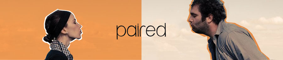
Paired is a set of wearable, networked devices exploring intimate communication between people via screenless, interactive technologies. This was my graduate thesis project while attending ITP.

DESCRIPTION

Our current digital tools empower us to interact with our environment in new ways, being able to connect with more people and things at once. While the modes of communication and how we connect are expanding, what happens to the depth of our messages? In digital spaces, we can send an email, voice, texts, pictures, videos, approval, and even money. What if we wanted to send a pat on the back, a hug, or “I’m thinking of you”? Paired is worn near personal spaces on the body. Couples send and receive messages via Paired’s tactile interface. These simple notifications form a language that’s real-time, subtle, and intimate between lovers: the physical rendering of a sweet nothing from a distance.

PERSONAL STATEMENT

I am interested in how people communicate with one another through the use of digital tools, and what it is that can be communicated. Are there ways that we can express a feeling like empathy or compassion with more than text messages, pictures, and the like? How can we improve the quality of digital communication to build healthier relationships with one another? There is research that suggests hearing the heartbeat of someone you are talking to gives the same feeling of personal contact as looking at that person in the eye. Affective computing uses sensors to bring emotional and subconscious data out from the body and brain. But there has been little done in communicating conscious, emotional data in a way that’s personal.

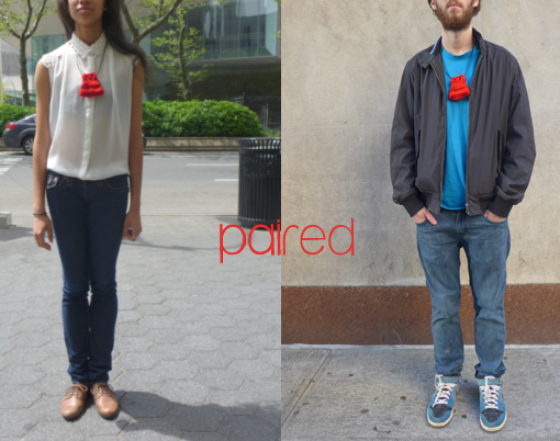
Paired is a set of necklaces for couples to be worn near the skin. When you grab one, as if you were holding your heart, it warms the other, essentially warming their heart. It’s the physical rendering of a sweet nothing from afar. Paired pulls your interaction with your partner off screen, out of your pocket and away from your other daily digital interactions. It lives in a private space on your body, on your chest, and reserves that space for only sending and receiving messages from loved one.

Computers and technology are able to both invade and protect our personal spaces. How we create and sustain bonds in our most personal spaces, our relationships, will include them in the future. Paired is my thought process for how we might begin to interface with this entity.

RESEARCH PROCESS

I’ve done the bulk of my research in human communication, human bonding and relationships. Bonding is the process of attachment that happens between parents and children, romantic partners, close friends, and groups like sporting teams or people who spend a lot time together. Oxytocin, also affectionately known as the ‘love hormone,’ is the hormone largely responsible for allowing this type of attachment to happen. With humans, we release oxytocin and create bonds while performing behaviors like giving or receiving massages, kissing, holding in stillness, synchronized breathing. Many of these behavior involve touch, with the intent to comfort. My idea is to create some resemblance of touch through a device, and knowing that this touch came from your loved one, it would release oxytocin, and create a feeling of intimacy though this distant communication.

DESIGN PROCESS

I’m focusing on communication that’s intimate, meaning between people who are very close whether they are romantic partners, family, or close friends.

Based on research and things I took from testing other products in this realm, I came up with four design pillars for Paired. For Paired to be successful, it need to be:

  • Real-time: with things like SMS, twitter, etc., we are now accustomed to communications that are happening in the now. The user will be able to send love exactly when they want and it will be received a few seconds later.
  • Subtle: see below
  • Intimate: subtle and intimate go together. It’s the space that the project lives in, intimate relationships. With intimacy comes a sense of privacy, so it’s important that the interaction are subtle.
  • Wearable: Making it a wearable would mean it would live as close to the body as possible, which plays directly in the intimate space in relation to how we interact with other people. It connects the two users directly to each other and in a way connects their bodies themselves.

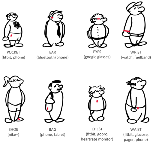
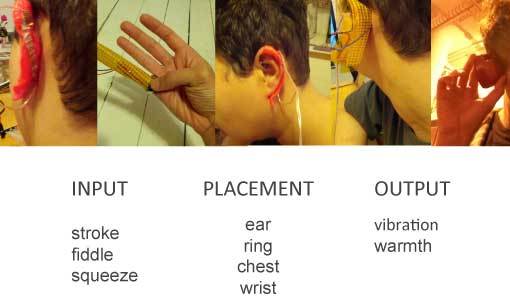
I mapped out how we currently interact with popular wearables like the fitbit and gopro and then thought about designing for personal spaces on the body like the ears, hands, wrists, crotch, neck, and chest. I came up with a system of input for sending a message and outputs for receiving the message. For input, I used stroke and touch, and for output used vibration and warmth.

wearables-together

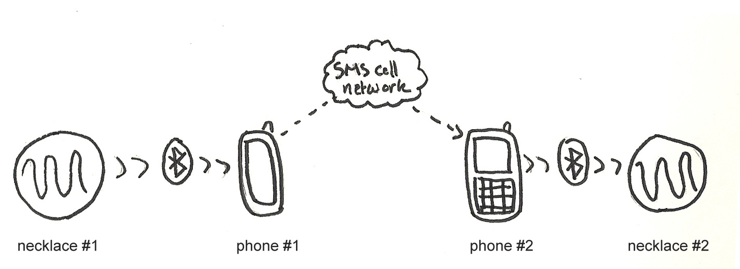
In the end, I landed on making necklaces that live close to the chest. You apply pressure and the other one becomes warm.

paired-better

PRODUCTION PROCESS

techshot-healed

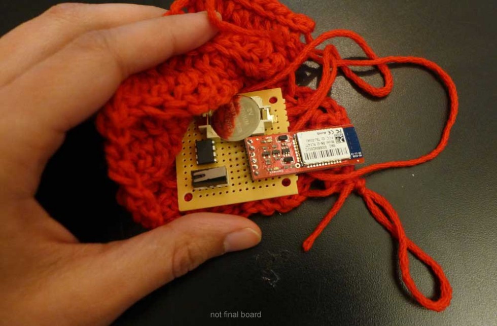
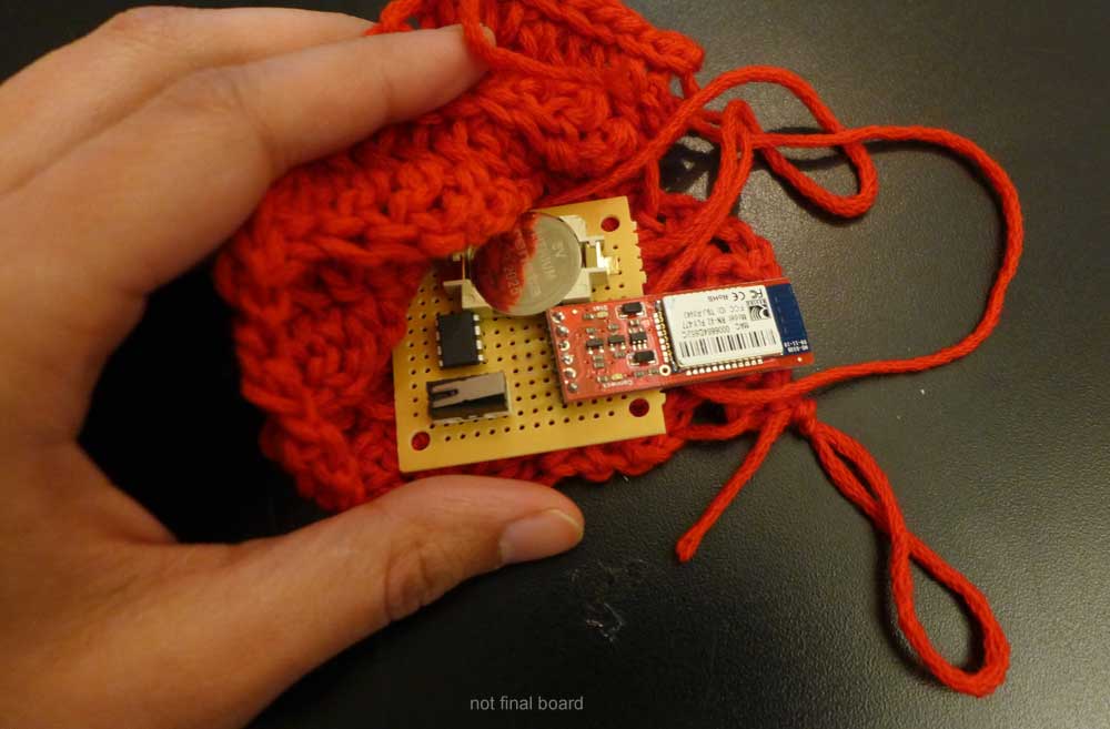
Fabrication was my weakest area coming into this project. Luckily I had a lot of help. I met with friends and classmates who were better versed in this, and got help in making the necklaces. They are made of crocheted red wool and hang on a leather strap. Paired is made up of:

  • an ATTiny85 microcontroller which handles the logic
  • a bluetooth modem for sending and receiving data to the paired cellphone
  • a switch for sensing when pressure is applied
  • conductive thread which warms up the pouch
  • and a battery.

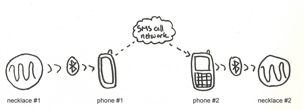
Technically, I made Paired as a mixture of physical computing and Android app development. When one Paired necklace is squeezed (or when pressure is applied) a message is sent via bluetooth to the wearer’s phone running the app. The app then sends a special SMS to the other phone number, who is also running the app. When that phone receives the message is stops it from reaching the phone built in messaging system, and alerts the second device to become warm.

network-details

It took me some time to finally get into production, because I was getting caught up in user testing and research. I finally decided to go with my gut and move forward with my original vision for Paired.

USER TESTING

placement

Once I came up with the basic inputs and outputs, I made very rough prototypes to test the different sensations. I used clay as my prototyping material and connected two ‘devices’ with really long wires, since the system was not wireless yet. I first tested with me and my partner and we found it to be a novel and fun interaction.

So I planned a user test with 4 others to try them too. My strategy was to simulate that the output might happen at any random moment throughout their day. I attached the device to them and I had them read a really long article online. At some point, I triggered the output, and then we talked about it. I repeated the test the same person by asked them to think about their partner. There are more details about this on the blog.

Most of my users did not like the product. They mostly had a very extreme negative reaction to it. They said it was awkward, alarming, it made them nervous, it made them think of danger, etc. Here are words that came up during this user test:

shocking
doorbell
nervous
squeezed hand
felt nice
abused
wouldn’t wear it
open to try
uncomfortable
alarming
danger
dumb-down
awkward
concerning
distracting
concerned
warm
parallel sensations
cheap communication
aggressive
subtle
alarming
pinch

It was hard to replicate the context that Paired is supposed to be in. First of all, I was sitting right next to them the whole time. Second, their partners were not involved in the user test, I only had them think about their partner. It made sense that they would feel awkward. I’m also dealing with intimacy which is a very personal thing between two people, and not something you can ready share with others. The user test itself was awkward. Even I felt awkward administering it! I could have been projecting my awkwardness that as well. I went ahead and made what I envisioned anyway.

FEEDBACK

Most people really liked my concept and where I was coming from. It seemed like people were way more interested in the concept than in the physical product and how it worked. I’ve received a fair amount feedback throughout this process. Here are of a few of them with my response.

Suggestion: Emotions are complex, maybe you should try to build in other sensations/intentions, not just warmth, maybe a pinch for example.

My response: This was a good point. But I did not have time to address it. I also wanted to keep it simple. Emotions are complex.

Suggestion: What about reciprocity? When you hug someone, you are also hugged. Is that something you can build in? and how?

My response: I really considered this early on in the project. All good communication has some reciprocity. Again I needed to keep it simple. Paired is like a sweet nothing or a physical ‘Facebook poke,’ one way.

Suggestion: You’re dealing with affection, and affection can be freaky. That’s ok. You don’t need the users to validate it, there are tons of affectionate behaviours that others find creepy or weird, and you should play that up.

My response: Totally valid, probably why my users in my user test freaked out. In the end, I made what I envisioned it should be and it worked out.

Suggestion: It’s like a ‘poke’, the invitation is too low

My response: This is true. It IS like a Facebook poke, but it doesn’t take away what role these ‘pokes’ have in our bonding behaviors. It is true that over time it could be abused and lose its meaning. That’s up to the people who are using it. But it is interesting to think about the longevity of this product.

CONCLUSIONS

After my user test I struggled with what to do next. I thought I needed to refine my test, try different environments and contexts, different sensations and placement, to get results that were more positive or closer to the sensations I was trying to create. This would mean my project would turn into a research project. I like research and user testing but in talking to my peers I was reminded that I actually started this process with the intent of making something. This was a turning point for me. I had to make a decision about what this product was finally and start making. I learned that sometimes you just have to go with your gut.

For next steps, I’d like to work on the form. One of my design pillars was ‘subtle’ and as lovely as the red crocheted necklaces are, they aren’t very subtle. It doesn’t feel like a secret between two people, which is fine, but very much strayed from the design intent.

Balloon Wars

balloon_wars_logo

“It’s war. Don’t get popped.”

As featured at the Come Out and Play Festival at Governor’s Island in 2012.

Balloon Wars is a history of combat told through balloon stomping. A variety of short games can expose players to the varied ways we have battled each other, from asymmetric warfare to the charge, we explore them all through a fun and engaging mechanic that everyone (with feet) can play.

Players tie a balloon to their ankle using a piece of string. The balloon is their life. When it pops, they are done. The key to victory throughout all of the mini-games is to use your feet to stomp out your opponents’ balloons, while protecting your own.

Simple Direction, wayfinding app

David Gibson, wayfinding expert and author of The Wayfinding Handbook: Information Design for Public Spaces, spoke to our user experience class a few weeks ago. After his presentation on how he and his team design wayfinding experiences, we had an interesting discussion around GPS navigations systems. A classmate told a story of how his friend, new to NY, a year later still didn’t know where anything in the city was. He used Google Navigation to get anywhere. His face stuck on his phone, he spent all his journeys, long or short, watching his blue location arrow advance and made sure it followed the glowing digital path laid out for him.

The awesome thing about GPS navigation systems is that you’ll never get lost. There are even algorithms for travelling the shortest route, the cheapest route, or the route with less traffic. But the thing that sucks about GPS Navigation is also that you’ll never get lost. Following bullet pointed, step-by-step directions takes away from the opportunity to discover things on your own.

Learning Through Mistakes

As humans, we learn from making mistakes and from making the wrong turn, literally and metaphorically. If instructions for solving a problem are just laid for us in bullet points, we won’t remember as much than when we  have to build logical and emotional connections ourselves.

…and Having Fun While Doing It

There’s a theory of fun in game design that I’m finding to be supported more and more in my own observations. Raph Koster, in his book “A Theory of Fun” concludes that fun equals opportunities to learn.  An activity is deemed fun when it’s not too easy that you get bored, it’s not too hard that you get frustrated, and that the opportunities to learn are well paced.

In my experience, sometimes getting lost is much more fun, then getting to my destination.

The Simple Direction Mobile App

The app I’m building is a navigation system for mobile devices simply letting you know if you’re going in the right direction, leaving opportunities for finding your own way through discovery and even getting lost. It’s the only wayfinding app that finally values the journey over the destination.

I wanted to strip down a navigation system to a core idea: to let the user know what direction they should going to get to their target destination. It’s a sort of customized compass that points in the direction you need.

The idea is that you could be walking, biking, discovering the space around you. And when your ready, you can check the app and make sure you’re on course. The app doesn’t care whether you follow the arrow or not. It’s just a reference and it’s there whenever you choose to look at it.

How it works

The HTML5 app prompts you to either enter a new destination or save your current location as place you’d like to return to. As you move about, you current location and bearing (heading) is calculated in relation to the destination. The latitude and longitude coordinates of your target destination are saved in local storage of the browser, so you can close the app and come back it whenever, even days later, and it will give you a reference to that location. You can change the destination at any time.

I’m using Google’s geocoder for translating the latitude and longitude coordinates to an address and vice versa.

How it doesn’t work (yet)

I’ve been able to get current location, save a destination location, and calculate the distance between the two in kilometers and in feet, get the direction you are heading in relation to North. However, the main part of the app is still  in progress: pointing the arrow to the destination location. I also want to calculate the distance in terms of a time estimate based on how fast you are currently moving.

More on this come. You can follow the code on github.

Digital Periscope

Digital Periscope is an user-controlled installation to be put up at 240 Central Park West, which shares the view of Columbus Circle, Central Park and most of midtown Manhattan from the roof of the building, with people in the lobby.

Project by Michelle P Boisson, Kaitlin Till-Landry, Tak Cheung, and Mark Breneman.

Our group was asked to design something for the residential building at the corner of Columbus Circle, 240 Central Park South. We had unprecedented assess to the building thanks to the building’s owner (Jim) and manager (Peter). After a few visits to the building, which included the subbasement’s water heating to the tippy top of the roof, and meeting with a few residents we started to brainstorm possible interventions. One thing we were really impressed with was the vantage point on the roof. It over looked Central Park, Columbus Circle and surrounding canons of modern skyscrapers. We thought it was be a nice feature to provide this vantage point from the street level, making the building into a physical building periscope.


The installation was a lot of fun, scary at times, since we had to climb to the very of the building to install this camera.


Once we had the camera up, we could view it and control it remotely. Here’s a screen grab of us checking out the view.

Screen Recording of Roof Cam from Michelle Boisson on Vimeo.

For the physical form of the viewing device we wanted to keep the aesthetics of a periscope but we knew we had to work within the space. At first we wanted to have this be an optional indoor/outdoor platform. We realized later it would suit the building better being only an indoor viewing device.

The prototype:

A first rending:

Next evolution:

Screen shot 2013-02-15 at 12.44.07 PM

Screen shot 2013-02-15 at 12.43.54 PM

Screen shot 2013-02-15 at 12.44.15 PM

Screen shot 2013-02-15 at 12.44.26 PM

The client liked the idea behind this but was worried about the amount of space it takes up and the color which doesn’t match with the aesthetic of the building. With that in mind, we came up with the following idea which they accepted. This final concept design is lighter and borrows from the aesthetic of a periscope. The eye piece rotates up and down for tilting the camera and the whole base rotates around sideways to pan the camera.

final concept screenshot

a walk through of some rough sketches:

https://vimeo.com/61324106

password: digital periscope

ME&Useum

Overview

After a talk giving by Curtis Wong, creator of The WorldWide Telescope (WWT), my team put together a response for our classmates in the form of a presentation. Our response: Personal narratives and immersive environments create memorable experiences. We decided that for our presentation, we would turn the lecture room into a museum space for our classmates to explore, to learn about the members of our team and to share their own narratives.

Personal interaction and narratives

The ME&Useum is museum about our class. We transformed our usual lecture space, which is in effect a theater, into an open space to be roamed around at everyone’s leisure. Before even entering the floor of the space, we had everyone line up downstairs. Matt, Mick, and Sheiva took turns bringing groups of about 10 people at a time and leading them upstairs. As they walked with their group, they introduced themselves and explained the setup. Everyone was given a map key for the different exhibits and a glow stick since the room was dark.

Once the group got to the front doors, they would meet with either Hiye or myself. We introduced ourselves and lead them to the coat check area of the room before letting them roam the space on their own.

We made our introductions this way to make the experience more personal. A group of 10 was small enough for us to get everyone in quickly and still be able to personally address each person.

Inside the museum were six exhibits. The exhibits were where our classmates could learn more about each other and share their personal experiences. The six exhibits were:
– Write a letter to your 10-year-old self
– Draw your biggest fear
– Tell us about your first kiss
– What’s the craziest thing you’ve ever done
– What’s on your bucket list
– Add a song to the ITP playlist

At each exhibit, there were note cards filled with personal narratives from our group, and blank cards and markers for people to add their own stories.

Immersive environment

Creating an immersive environment was important for this project. In order to make this memorable, we needed people to feel like they were entering a new space. By changing how they entered the space and personally escorting them into the room, we already planted the expectation that this was going to be different. We originally talked about having coat check outside of the room which would make the entrance even more dramatic. However, logistically it was just simpler to guide people to a space inside the room.

In addition to the introduction to the space, we created a more immersive environment by dimming the lights to near darkness and having people navigate through the light of their glow sticks. The stations were clearly marked with lit color marks that matched the map key.

We were also in costume the entire time and played some background music to set the mood.

Levels of engagement and disengagement

Because we were transforming how people experienced the space, as well as asking people to participate, we wanted to make sure we didn’t overwhelm anyone. We were asking them to share personal stories which could be anonymous if they wanted. If people didn’t want to share they could simply read what our group had shared and what other people were submitting.

To take the level of disengagement even further, we had an area of the museum that we called The Planetarium. At the front of the room, on the stage, we laid out pillows and blankets for people to lay and relax. From there, if you look up we had projected an animation that made it look like you were flying through Space, but in between the stars flying at you were cutouts of all of the current students’ head with their name. It was a silly way to help everyone to get one another’s name. Yet it didn’t take any effort on the part of the participant. They could just relax.

We understood that different people are interested in different levels of engagement, or they could simply be tired and not in the mood to walk around. We didn’t want to create any pressure. We wanted everyone to do what they wanted but have tools to participate if they so chose. All of these options were explained to them in the introductions.

Surprise and Discovery

In our discussions about Curtis Wong’s presentation, we talked a lot about discovery as part of the memorable experience. The term “discovery” didn’t make it into our formal reaction, but it was a significant part of it nonetheless.

In our map handouts there was item called Mad Skillz that wasn’t marked like the other items. This part of the exhibit was actually a photo booth placed outside of the room. A few people found it and got to take their picture displaying a skill that they had on a dry erase board.

Another bit of surprise that we planted were hand written love letters to each of our classmates. Each letter was written by one person in our group and Hiye and I placed them one on top of everyone’s bag as they were exploring the space. It was meant to be small personal gift from our group.

Group Collaboration

This project was a huge undertaking for us to pull off in a week. I feel truly lucky to have been placed in a group that was dedicated to making this happen. We met every day and stayed stayed late some nights, much later than any of us really wanted, but we all were so really excited to see this through to fruition.

We were fortunate enough be able to build on each others ideas for first few days then we were able to scale down to what was realistic and cutout parts that didn’t support our core reaction.

Memorable experience

Seeing people’s faces as they were first entering the space was priceless. As I was in the middle of my introduction, they were barely listening to what I saying and trying to peer over my shoulder into the room. We had built up all this anticipation as they waited downstairs with their maps and glowsticks and then through the introductions coming up the stairs.

Overall we got a pretty good response from our classmates and from Red Burns. Red complimented us on transforming the room and said that Curtis would have loved it too. The biggest compliment we got, in my opinion, is when a classmate said they like that we had created a “safe space” for everyone to share and participate as much or as little as they wanted. This was big for me because I know myself and I know that I’m not always the first person to volunteer my participation or personal information. While that is something I’m always working on personally (being able to just jump in and speak or take risks), I knew there were others like me who might hesitate at first. Everything in our presentation was optional, even their attention. Each person’s experience in the space was personal.

I had such an amazing time working on this project. We worked really hard on this. And it’s by far my favorite experience at ITP so far.

Interactive Jellyfish Light Sculpture

The jellyfish is an interactive sculpture that emits lights and is able to hear and speak like a living organism. When people get closer, her heart starts beating and she emits light and makes sounds in her own language. As she is from the deep sea, we don’t exactly know what she is saying, but she wants to communicate with people.

The lighting sculpture is constructed from laser-cut acrylic and a matrix of 12v. LEDs that are soldered together in a way that allows each LED to be controlled individually. The sculpture also has range finder that senses when an object or person is close, and speakers.

Techn-icalities: Arduino Uno, range finder, Processing (for music), white 12volt LEDs strips, clear acrylic panes, Max7219 chip, Tip 120 transistors

Emo Ant HTML5 Comic

This comic is an experiment using new front-end tools available with webkit browsers. with an interactive interface online. As the user scrolls down, the story advances with animated transitions giving the user full control of the flow and speed. I’ll be using parallax effects, css3 transformations, and javascript queueing for the speech bubbles.

See the comic here: emoant.com

In this story, Cameron is a rebellious teenage ant. We meet him at the breakfast table with his family while his hundreds of siblings are diligently doing there part. Cameron, on the other hand, flies into the scene on a makeshift parachute he built himself, and scoffs at the processed foods and artificial ingredients. His emo hairstyle and dress makes him stand out even more and are the topic of conversation between Cameron and his parents.